Understanding the underlying trends of your numbers in Excel enhances their significance, a skill that is essential in today’s dynamic environment. Using the Excel Trend Function helps in identifying patterns in historical and present data while also predicting future trends.
What Is TREND Function Used For?
The TREND function in Excel has three primary functions:
- Calculate a linear trend based on a given dataset.
- Project future values based on current data and
- Create a trendline in a graphic to facilitate forecasting.
TREND can evaluate performance or project financial outcomes in a professional setting, and it can also be used in personal spreadsheets to monitor expenditures, estimate team goal achievements, and serve several more purposes.
How Does Excel TREND Function Work?
The Excel Trend Function computes the line of best fit on a chart via the least-squares method.
The line of best fit is determined using the equation
y = mx + b
where
- y is the dependent variable,
- m is the gradient (steepness) of the trendline,
- x is the independent variable, and
- b is the y-intercept (where the trendline crosses the y-axis)
While it is not imperative to possess this knowledge, it is beneficial for selecting the components to use into your TREND formula syntax.
What Is the Syntax for the TREND Function?
Having understood the concept of a trendline and its calculation, we shall now examine the Excel formula.
TREND(known_y's,known_x's,new_x's,const)
where


- Known_y’s (needed) are the dependent variables that will assist Excel in calculating the trend. In the absence of them, Excel is unable to compute a trend, leading to an error notice upon input. These values would be represented on the y-axis of a column chart.
- The known_x values (optional) are the independent variables positioned on the x-axis of a column chart, and they must match the length (number of cells) of the known_y reference.
- new_x’s (optional) refers to one or more sets of new independent variables on the x-axis for which you wish Excel to compute the trend. This instructs Excel on the quantity of additional y-values to incorporate into your data.
- const (optional) is a boolean value that determines the intercept (value b in y = mx + b). FALSE compels the trendline to intersect the x-axis at 0, whereas TRUE indicates that the intercept is applied conventionally. Excluding this option is equivalent to inputting TRUE (standard).
Related: External Links in Excel; How to Find and Edit?
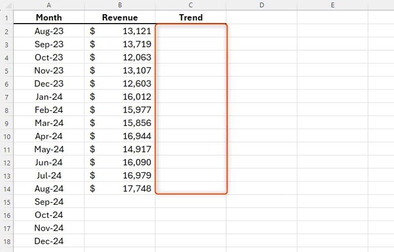
Calculating Your Existing Data’s Trend
The next example presents the revenue for the preceding months, and we aim to analyse the trend of this data.
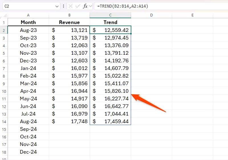
We must input the subsequent formula into cell C2:
=TREND(B2:B14,A2:A14)
B2:B14 represent the known y-values, while A2:A14 denote the known x-values. At the moment, we do not require any additional x-values, as we are not generating any forecast revenue data. Furthermore, a constant value is unnecessary, as establishing the y-intercept at 0 would produce erroneous data.
Press Enter after inputting your formula to see the trend shown as an array.
Forecasting Future Numbers
Having established an understanding of our data’s trend, we are prepared to utilise this information for forecasting the upcoming months. We aim to finalise the trend column in our table.
In cell C15, we shall input
=TREND(B2:B14,A2:A14,A15:A18)
B2:B14 represent the known y-values, A2:A14 denote the known x-values, and A15:A18 signify the new x-values for the predictive trend being calculated. We have not designated a constant value, as we desire the y-intercept to be computed ordinarily.
Press Enter to view the result.
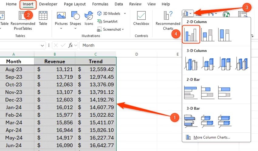
Using TREND With Charts
Having gathered all data up to the present date, along with the forecast trendline for the upcoming month, we are prepared to visualise this information on a chart.
Highlight all data in your table, including the headings, then select “2D Clustered Column Chart” from the Insert tab on the ribbon.
At first, both the independent variable (revenue, in this example) and the trendline will be displayed on the x-axis; however, we like the trend data to be represented as a line.

To modify this, click on the chart and pick “Change Chart Type” from the Chart Design option in the ribbon.
Select the “Combo” chart type and ensure that your trendline is configured as “Line.”
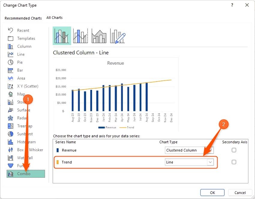
After that, click “OK” to view your new chart, which will display the trendline as anticipated, including projections for forthcoming months. We have also selected the “+” in the corner of our chart to eliminate the data legend, as it is superfluous for our chart
Conclusion
If you do not wish to view predictions for the future in your data, you can incorporate a trendline into your chart without utilising the TREND function. Hover your cursor over the chart, click the “+” in the upper-right corner, and select “Trendline.” Trends can also be visualised using Excel’s Sparklines, accessible under the Insert tab on the ribbon.